
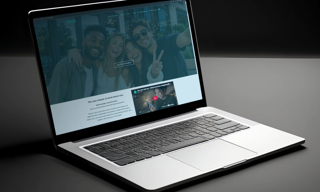
Before there was a finished app, there had to be a place to explain the idea behind it.
That’s where this website came in.
From the beginning, we knew we didn’t want Phresh to look or feel like another tech startup. No futuristic gradients, corporate buzzwords, or promises about “revolutionizing” the world.
We wanted something that felt human.
The concept started with the same inspiration behind Phresh itself: a little bit of ’90s nostalgia mixed with something that feels completely at home today. Bold typography, playful details, familiar references, and just enough personality to remind you of a time when being online felt exciting, weird, creative, and fun.
But underneath the nostalgia is something much bigger.
This website has become a place for us to figure out how to put the idea of Phresh into words. Why are we building it? What do we think social has lost along the way? And what could we do differently?
Those questions have shaped everything from the colors and artwork to the features we’re building and the words you’re reading right now.
Like Phresh, the website will keep evolving as we do.
For now, consider this our little corner of the internet.
We hope you stick around.
— The Krew